


Hate to be a boomer but Gold looks nice
Over the long-run, Bitcoin takes market share from gold as a store of value reserve asset, but the current macro backdrop favors the old school version today.

This article dives into the macro forces at play today and how they’re all intertwined. The TLDR?
Interest rates are at or near peak. It’s irrelevant whether or not or when the Fed will raise front end rates another 25, 50 or 75 bps because they will be forced to stop due to a) unaffordable government interest expense on the back of the most rapid rate increase in >20 years with debt to GDP at record highs (130%) or b) a recession. The inverted yield curve is saying the same thing.
(bullish gold)Gold is primarily a US dollar hedge (comparing its or Bitcoin’s performance to US inflation doesn’t make sense). The dollar wrecking ball theory is likely on hold as demand destruction will both lower commodity prices (bolstering RoW currencies) and force a more dovish Fed.
(bullish gold)Oil and commodities are ripe for a long-term secular bull, however demand destruction is a headwind that likely wins out in the near-term. Oil and the dollar have traded with positive correlation that may continue (opposite the historical trend).
(neutral to bullish gold)Interest rates and inflation differentials also point to dollar weakness ahead vs. RoW
(bullish gold)Gold is only down -10% in the face of the most aggressive, coordinated tightening, interest rate hikes and dollar strength in decades. And that trend is reversing - similar to late 2018
(bullish gold)Gold provides a better hedge against a negative macro or liquidity event than treasuries, Bitcoin, US dollar or commodities
Contents:
Overview of key variables: Interest rates, inflation, US dollar, Gold
Late 70s / early 80s comparison
What role do commodities play?
Interest rates and inflation
Monetary policy and central bank balance sheets
Why gold? Why not Bitcoin or treasuries?
Let’s start with the basics.
A few key macro variables to think about here are the interest rates (orange, bottom pane), inflation (blue, bottom pane), US dollar (yellow, top pane) and gold (candles, top pane).
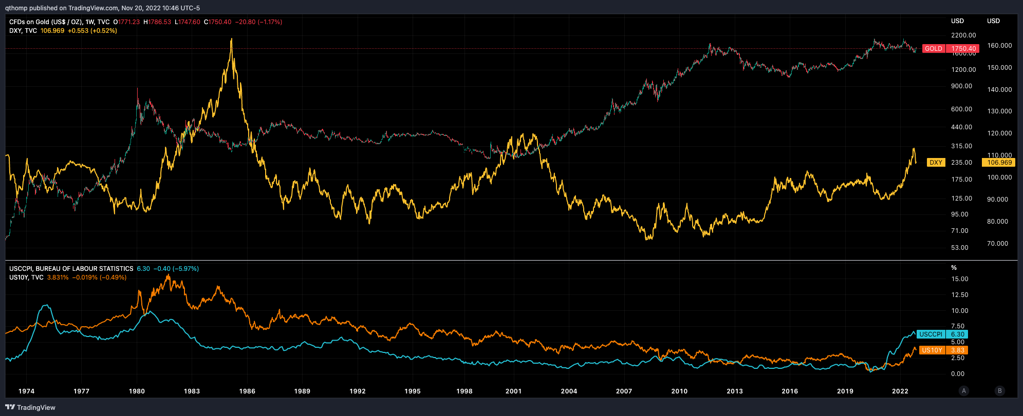
Gold and the dollar are often inversely correlated. The chart below plots YoY % change in the DXY (blue, top) and Gold (yellow, bottom). As you can see, periods of dollar strength of this magnitude often indicate worse gold performance.


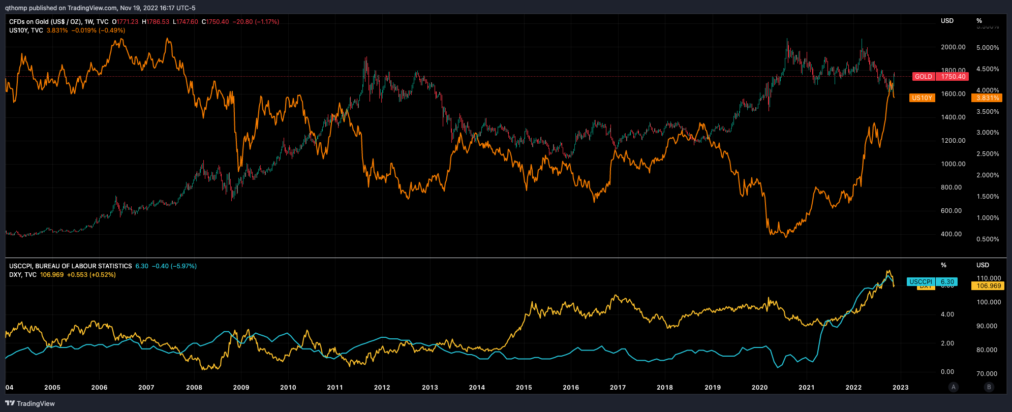
Gold and US Treasury bond yields are typically inversely correlated because rates are fall in periods of economic weakness which leads to monetary easing. Since falling yields mean rising bond prices, Gold and bonds are usually positively correlated. It’s likely we are at or near peak rates today.

The counter would be that inflation is still too high. However inflation already has peaked and the Fed is unable to keep hiking much further due to high Debt / GDP levels. Below highlights Fed funds rate (blue, top) and Debt / GDP (orange, bottom).

I wouldn’t be surprised if we’re facing a more structural inflationary environment than the 2% economists predict. Something like a drop to 3-4% as global demand gets hit, but then rearing its head again as monetary and fiscal stimulus will be forced to resume in a time where structural supply issues are not being properly addressed (de-globalization and underinvestment in commodities).
We know once the government opens the komodo on new stimulus measures, they aren’t put back in the box. The stimulus checks and fiscal rampage used to combat COVID (that caused this bout of inflation) will be used again and could cause rolling bouts of inflation if the supply issues aren’t fixed yet, but I don’t think it really matters. Debt / GDP is only going higher and the Fed will be forced to follow its BOJ and ECB predecessors in monetizing the deficits by keeping a lid on rates or risk breaking the financial system.
Along the same lines, since yield curve inversions typically precede recessions, which lead to lower stocks (and lower rates), Gold often outperforms the S&P 500 after yield curve inversions as shown in the chart below. 10Y-2Y US treasury spread (candles, top pane) vs. Gold / S&P 500 (orange, bottom pane). Rising orange line means Gold > S&P performance as seen in early 2000’s through 2011.


For historical context, I think it’s also useful to look at the late 70s / early 80s which was the last time we saw inflation of this caliber.
Gold (candles, top pane) was rising in tandem with both inflation (blue, bottom pane) and interest rates (orange, bottom pane) in into January of 1980. The dollar (yellow, bottom pane) however was weakening alongside large US fiscal deficits. Volcker finally broke inflation in 1981 which ignited USD dominance with the DXY peaking years at 160 in 1985, taking down inflation, interest rates and gold in its path. During this time, it’s safe to say gold worked as an inflation hedge.

That whole narrative though of gold being an inflation hedge makes sense over long time periods and across the globe, but the idea that it should trade inversely to US inflation is quite bogus. The US dollar is the world’s reserve currency as it is in the highest demand globally and necessary for trade - Gold serves as a hedge against it. The chart below displays that Gold (YoY % change in yellow, bottom pane) really only worked as an inflation (blue, top pane) hedge in the late 70s when the dollar was getting crushed. Since then, gold has actually outperformed during times of declining US inflation.

Which makes sense: A store of value asset is a hedge against inflation only in the sense that it is held to protect against currency debasement (caused by inflation). But that doesn’t mean you should measure its performance against inflation, but rather the currency you want to be protected against (in this case the dollar). You hold a store of value asset so you can go to the store and buy the same amount of groceries as your currency used to buy you, not as ‘inflation’ used to buy you. It’s also important to remember these are global issues, not just US centric, so you must look at against global inflation and global fiat currencies in aggregate.
Hopefully this also lays to rest the stupid arguments that Bitcoin should trade inversely with inflation as an ‘inflation hedge’. Over a long enough time frame, yes inflation should cause a fiat currency to depreciate and the store of value asset to appreciate relatively speaking. However, performance should be measured against the base currency, not its inflation, because currencies are all relative value based - there are many other factors that go into the equation. As it works with gold, it is the same for Bitcoin - both are hedges against the world’s most dominant store of value asset, the US dollar. So in times of dollar strength, you’d expect underperformance.
So, back to the late 70s / early 80s. When comparing things to today, there’s a number of similarities and differences. Similarities include rising inflation and interest rates for the past 2 years since late 2020. Also similarly, fiscal deficits have been large. However unlike in the late 70s / early 80s, the dollar has performed well on a relative basis because the RoW currencies have had less hawkish monetary policies and slight economic underperformance. So when looking at Gold which is basically flat since government bond yields and the dollar bottomed in August 2020, it has outperformed similar periods of dollar and interest rate strength. This is actually quite interesting because in a time of bond yields screaming higher (prices down) AND the strongest dollar in 20 years, gold should be getting its face ripped off but it’s not.
Why is this the case? Well it’s all relative value, and I think the RoW is turning to gold over the dollar as their store of value asset - “according to the World Gold Council, central banks have bought more gold in 2022 than in any year since 1967”. And as a reminder, Gold is first a dollar hedge, and at times a global inflation hedge.
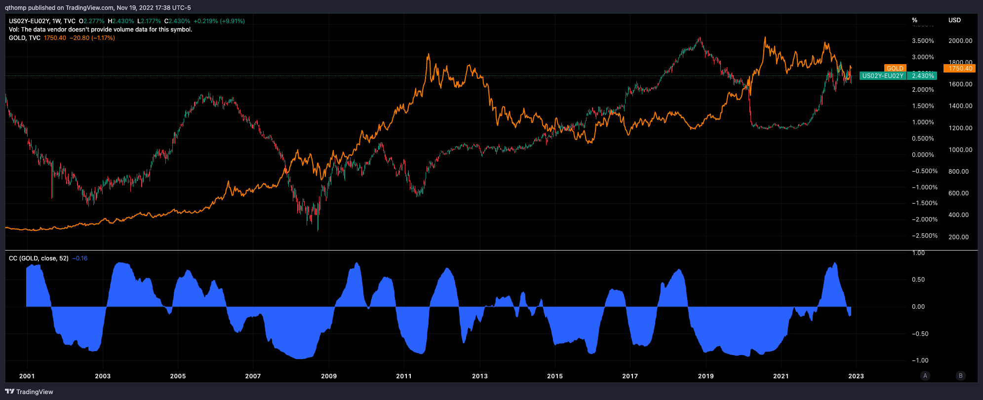
So why the differences from the 80s? Why has gold outperformed relative to history against rising dollar and rates. As mentioned earlier and shown below, the dollar (orange) and gold (candles) are usually inversely correlated with only brief periods of positive correlation.

Well compared to the 80’s, I would point to:
More globalized world (it’s no longer just the US’s inflation, rates and currency that matter)
A difference in positions of strength between US economy / USD vs. RoW. Ultimately the DXY can be viewed as a central bank tug of war seeing who can outdove or outhawk who. The dollar maintaining its relative strength has been largely due to the US’s energy independence whereas EU, Japan and China are large net importers and have faced serious energy headwinds. The de facto (EU) and actual (Japan) yield curve control mechanisms are putting tremendous pressure on the Euro and Yen. However, I believe it’s likely that market forces mean revert because:
Demand destruction keeps a near-term lid on commodity prices and relatively softens Europe, Japan and China’s energy issues (bad for DXY)
Falling demand, worsening economic conditions and the US’s debt / GDP constraints forces the US to slow its relative hawkishness vs. RoW (bad for DXY)
So where do we go from here and how do commodities play a role?
Well as of late, the dollar has come off handily from 113 to 106. Despite this dollar weakness, oil has also fallen - which follows the positive correlations of those two assets since December 2020, however that is unusual to see. Typically oil (candles) and the DXY (yellow) are negatively correlated - with the recent change being the most significant shift since the dot com bubble in August 1998 to December 2000.

What does this mean? Well a few observations:
When this correlation change happened last in the late 1990s, the US economy was diverging considerably from the RoW. Some background here.
Leading up to the GFC in 2007, we saw oil screaming higher but the dollar was falling off a cliff. This can largely be attributed to diverging economic outlooks, interest rate environments and significant investment inflows to emerging markets. There’s also likely a self-reinforcing feature as asset allocators looked to hedge against a weakening dollar by holding commodities and hard assets. Some background here.
These two periods can be somewhat seen in the chart below plotting US GDP growth (blue, top pane) vs. Europe’s (orange, top pane) with the differential plotted in the middle pane and price of oil in the bottom pane.

In both time periods of varying dollar moves we saw oil going higher. It seems like in both cases, oil was moving higher in line with synchronous global economic expansion and less in relation to the dollar. The peaks in late 2000 and middle 2008 coincided with the rolling over of economic indicators which is similar to what we’re seeing today.
Despite seeing less broader economic divergence today, the cost of energy has been a real issue for Europe, Japan and China which has led to stimulus and larger fiscal deficits to paper over the cracks and therefore weaker currencies relative to the dollar. Given there remains a structural underinvestment in the industry and the supply side problems seem here to stay, this really only gets fixed when oil and commodities roll over, at which point you’d expect to see the DXY’s relative outperformance to also take a step back. A fantastic thread on the topic below.

I tend to strongly agree with this sentiment, and we may be starting to see the oil flush now as global growth is likely headed lower. The question is how much of a flush given the structural supply issues (very long topic for a whole other discussion). But if this is the case that oil is falling due to lower demand, that is likely bad for the DXY as RoW’s energy issues are likely temporarily softened and the divergence of monetary policies begin to mean revert.
Now let’s look at the DXY in relation to interest rates.
The dollar often tends to be positively correlated to the spread between US and EU government bond yields. The chart below shows US 2Y - EU 2Y (candles) vs. DXY (orange). I think we’re at or near a peak in spread differential (US 2Y is at 4.5%) given the US’s predicament of not being able to raise rates forever (Debt / GDP, annual interest expense exceeding federal government revenues) and verbal indications towards a slowing in hikes.

You also arrive at the same conclusion when comparing US-EU interest rate differentials to inflation differential - it paints the same downward picture. Blue is US-EU YoY core inflation, while yellow is headline (candles are US-EU rates).

This also highlights the predicament Europe is in with regards to energy. The difference in core and headline is due to the rapid rise in Europe’s energy costs given their lack of independence, opposite of the US’s situation. Raise rates to combat inflation and wreck the economy or ease fiscal/monetary policy to save the economy but risk runaway inflation. Given the circumstances, I really don’t know what’s the right move. I’m a firm believer that this inflation bout is a supply side issue (commodity shortage), which tighter monetary policy doesn’t really solve. But eventually it kills demand enough to bring consumption in line with supply. The crux of the issue is structural however and will remain as long as underinvestment in hard commodities continues.
Now if you believe those interest rate differentials are at or near peak, that bodes well for Gold as shown below. Gold (orange) vs. US 2Y - EU 2Y (candles). Both 2006 - 2008 and late 2018 - mid 2020 were tremendous runs for the bullion.
Now let’s look at things in terms of monetary policy and central bank balance sheets.
The charts below are courtesy of Dr. Edward Yardeni (linked here). Orange = Gold bulls ,pink = Gold bears.
Firstly, as shown by looking at total major CB balance sheets, gold obviously outperforms during periods of large, synchronous balance sheet growth, with notable periods following the GFC and COVID crises. The periods in between, 2012-2015 and 2021-today, were periods of 1) significant dollar strength and 2) less significant global central bank balance sheet growth.
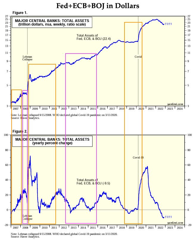
What sticks out is the level of balance sheet reduction over the course of this year but gold is nearly flat. Historically if YoY change in global balance sheets goes negative or even flat, gold does poorly. Despite that plus a strong dollar, gold is nearly flat YTD.
Diving into 1) further, the chart below looks at relative balance sheet growth across the three major CBs.

During the gold bulls, it is the Fed’s balance sheet growth that often leads the way. This also jive with the gold vs. DXY inverse correlation pointed out earlier. What stands out is the level of coordinated monetary tightening across all three major CBs. For example in the 2012-2015 gold bear, total central bank balance sheet growth was flat to low, however there was considerable divergence between the Fed (QE4) and the ECB (tightening). After coming off the largest, most coordinated global easing stint ever that ~2x’d the price of gold, we’re now seeing the opposite. In the face of the most aggressive coordinated tightening, interest rate hikes and dollar strength in decades, gold is only down -10% from its mid-2020 highs.
The trend is starting to reverse in Europe and Japan and the US is likely next. It’s difficult to envision a world where central banks can keep their foot on the tightening pedal.
So why gold? Why not Bitcoin or treasuries?
Let’s start with Bitcoin. As mentioned previously, I think as the world and its money turns digital, value will flow to a digital version of gold which today appears to be Bitcoin. However, that is not today given Bitcoin and the broader digital asset ecosystem are still tiny relative to gold and the existing financial system. So until then, Bitcoin and digital assets will trade alongside longer duration technology assets and are susceptible to the same risks. I’ve shown the two most recent/relevant macro events vs. BTC below.
Late 2018: A year into the crypto winter, Fed was tightening on ‘autopilot’. Treasury yields peaked in October/November and Powell’s hawkishness in the face of a slowing economy spooked markets. Stocks and Bitcoin began to sell off in tandem over the ensuing months with BTC actually leading the way and bottoming first. Equities eventually bottomed that ugly Christmas eve before Powell’s pivot came in early January noting the Fed is “always prepared to shift the stance of policy and to shift it significantly”.
Bitcoin/Gold (candles, top pane), S&P 500 (yellow, top pane), Bitcoin/USD (blue, middle pane), US 10Y yields (orange, second to bottom pane), gold (purple, bottom pane).

Early 2020: While rates continued to fall, crypto and equities had recovered by mid-2019. Crypto prices began declining after that through the end of 2019 with a slight rally into early 2020. Equities maintained their resilience with a very delayed reaction to COVID, peaking in late February. Similarly, Bitcoin began to sell off first and more aggressively, ultimately bottoming ~2 weeks before equities in mid-March 2020. Gold consistently rose through this time period. Although it was not immune to the liquidity crunch in March, it quickly recovered by April.
Bitcoin/Gold (candles, top pane), S&P 500 (yellow, top pane), Bitcoin/USD (blue, middle pane), US 10Y yields (orange, second to bottom pane), gold (purple, bottom pane).
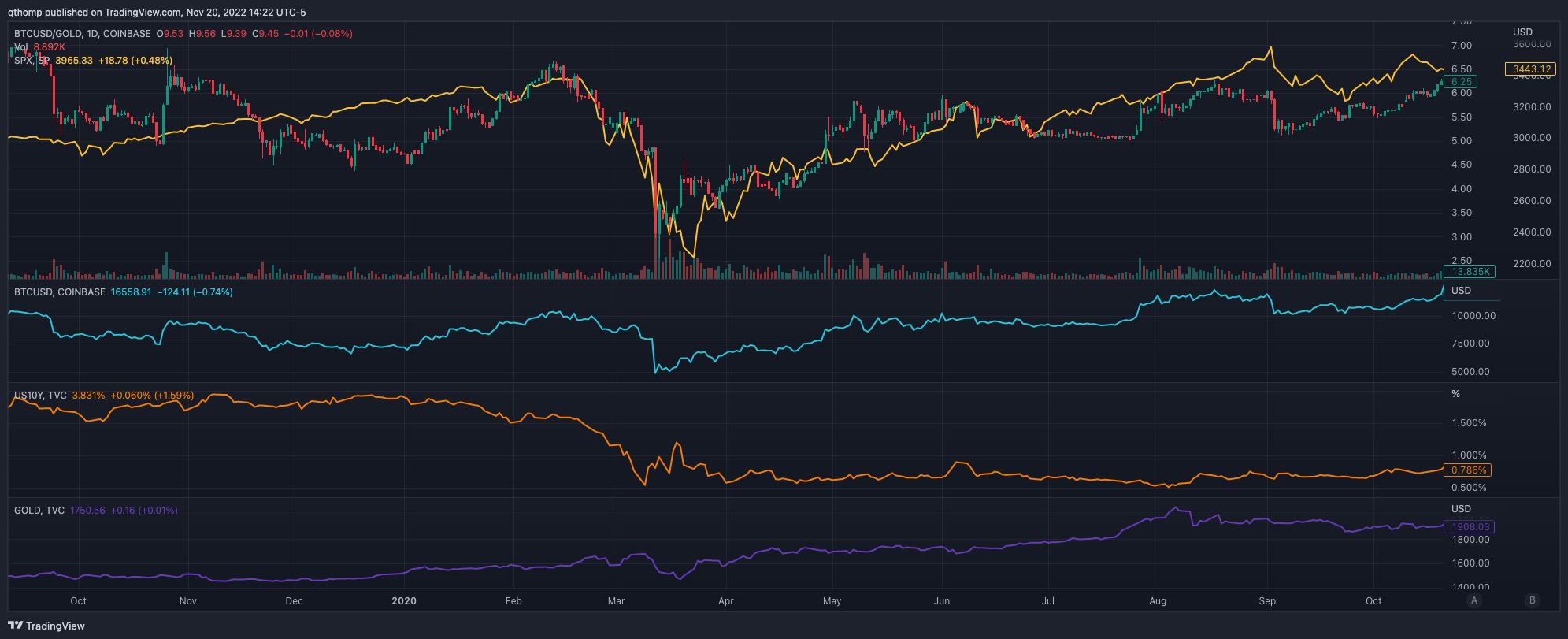
So it’s better to be in gold over Bitcoin until peak fear / liquidity event / sell off and then rotate into crypto.
Now onto treasuries.
Late 2018: From August 2018 to March 2019, gold was rising and outperformed treasuries. It is true however that during the brunt of the sell off, treasuries slightly outperformed gold for about a month. This is to be expected as rates sold off and there was a flight to liquidity and safety.
TLT/Gold (candles, top pane), S&P 500 (yellow, top pane), US 10Y yields (orange, middle pane), gold (purple, bottom pane).

Early 2020: Similarly, from June 2019 through February 2020, gold was rising and outperforming treasuries. Also similarly, during the brunt of the sell off in March, treasuries slightly outperformed gold for about two months as rates sold off and there was a flight to liquidity and safety.
TLT/Gold (candles, top pane), S&P 500 (yellow, top pane), US 10Y yields (orange, middle pane), gold (purple, bottom pane).

Overall, treasuries and gold perform similarly during downside macro market events. Given the timing of when the liquidity event actually happens is tough to predict, it’s better to be in gold if you’re early to the trade. Additionally, I wouldn’t be surprised if we got another rates ‘scare’ to the upside which would also indicate gold to be a better interim hold as well. There’s also the possibility that because of structural inflation concerns, long-end rates don’t come down much even when front-end rates do.
If you made it through this whole article, I’d love to hear your comments, feedback and/or thoughts. Don’t hesitate to reach out at @qthomp on Twitter.